Aperitivo Hour
The Brief
We were asked to celebrate the heart of Italian culinary heritage with a brand identity that felt as warm and inviting as an Italian dinner table. The challenge was to blend tradition with a fresh, modern twist—capturing that sense of classic Italian hospitality while keeping things current and approachable.
The Execution
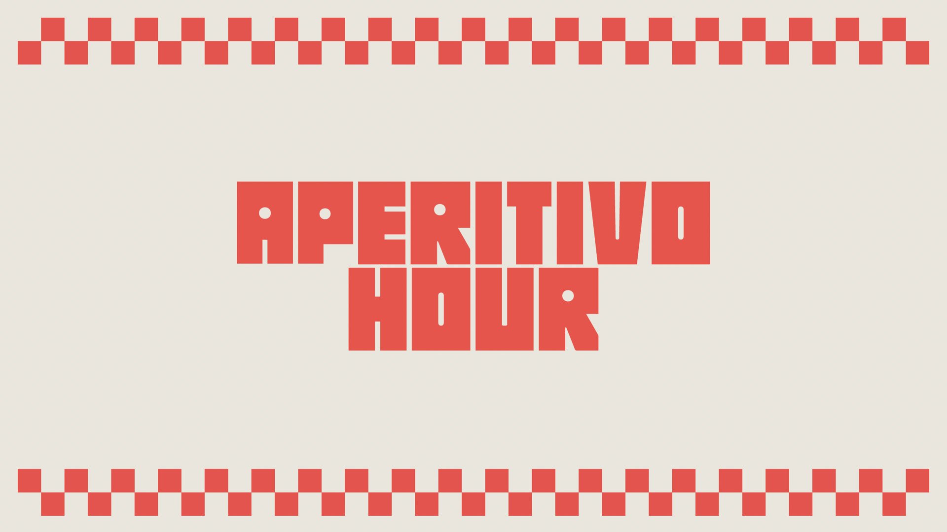
We anchored the design around the iconic red and white check pattern—something instantly recognisable as a symbol of gathering around the table. From there, we created a custom lockup for the project that draws inspiration from traditional Italian typography, but with a contemporary edge to give it a fresh vibe. It’s a perfect mix of old-school charm and modern style. Ciao!
Role: Lead Creative
Studio: Blink
Client: Public Library
What Was Involved:
Brand Identity
Wayfinding
Copy Writing
Art Direction